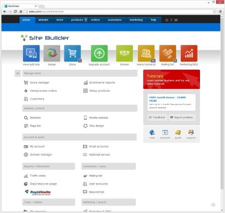
Admin user interface up-dates
The updated site builder includes new colors and icons to produce a more constant user experience on desktop as well as tablets. The side navigation menu is now collapsible, creating more space in the main content areas for adjusting settings.
Mobile website responsive/css
The new site builder update will instantly create a smartphone website based off of your alreadying existing main website pages. There is no need to edit the mobile website. The mobile site uses responsive/css design techniques to tweak the display to fit on smaller resolution devices.
When editing your site, you will see "website" and "mobile" links at the top right of the edit area. These links allow you to easily toggle between desktop and mobile views of the page that you are currently editing. The automatic mobile site could be disabled if you want your full web site to display on mobile devices. Custom settings include adjusting the mobile navigation bar, enabling your main menu, and choosing to enable/disable your site logo and banner.
The automatic mobile site can be disabled if you want your full website to display on mobile devices. There is no need to worry about or adjust image sizes (option to manually sizes images is still available if you wish to use it). You simply upload your images and the system scales the images to fit/fill in the content area. The new image styles take advantage of CSS features included in new HTML5 browsers (latest IE, Firefox, Chrome and most mobile browsers). The styles can apply to default images on your site, photo galleries and all of your product images.
Image gallery
Image galleries will be much easier to manage. If you prefer to use it), there is no need to worry about or adjust image sizes (option to manually sizes images is still available. You simply upload your images and the system scales the images to fit/fill in the content area. You just need to set the number of columns to use for the display. The images are adjusted to fit if the page width grows/shrinks.
Image styles
The new image styles make use of CSS features included in new HTML5 browsers (latest IE, Firefox, Chrome and most mobile browsers). This includes images with rounded corners, enhanced borders, shadows and circular shaped images. Choose from up to 4 different styles of images and apply them to your web-site. The styles can apply to default images on your site, photo galleries and all of your product images.
HTML5 audio support
If it is available in your browser, the updated audio player takes advantage of HTML5 support. This allows the audio to work much better across different platforms and devices like phones and tablets.
Payment gateways
Two new payment gateways have been added
- Stripe
- PayMill
HTML5 microformats
Support for HTML5 microformats has been put into product pages. Microformats are extra information added to the HTML of website pages that make things easier for search engines to index your website. It also allows for websites such as Pintrest to display more detailed information about your services and products with the Pintrest Rich Pins feature.
Design
New layouts and background images have been added.